Zrch | 2022 - 2023
Redesigning the Homepage to Drive Search Conversion
How I redesigned the home search experience for a real estate platform in Norway.
My team:
-
2 UX/UI Designers
-
1 Product Manager
-
4+ Software Developers
-
2 Software Testers.
My role:
-
Homepage redesign
-
Brand identity refresh
-
Competitor review


The challenge:
Hjem is a real estate search platform entering a highly competitive market in Norway.
As a newcomer, the product needed to quickly communicate its value, stand out from established competitors, and help users take action with minimal friction. However, the homepage was underperforming.
Low conversion on homepage.
-
Users struggled to immediately locate the search bar.
-
The primary action (searching for properties) was visually competing with other content.
-
Some users hesitated or scrolled without a clear next step, leading to drop-offs before conducting search.
Why visitors weren’t engaging with the search feature?

Usability testing:
I gave participants three short property-search tasks and timed how long it took them to find and use the search feature.
I encouraged the participants to think aloud during the process.
Average completion time was used as an indicator of friction: longer durations correlated with confusion or poor hierarchy.

Research finding:
-
Users didn’t struggle with feature awareness. They struggled with feature accessibility.
-
The search bar was visually buried, surrounded by competing call-to-action buttons and promotions.
-
The insights helped me redesign the layout to make search more prominent and reduce cognitive load.
Design approach:
I explored multiple layout directions for the homepage. The goal was to make the search action the hero — simple, intuitive, and the first thing users notice.


The final iteration:
The final iteration brought together the strengths of both previous approaches.
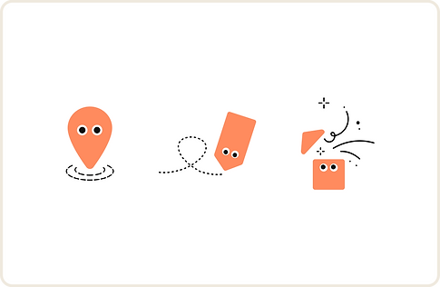
I demonstrated the brand identity and visual style to support Hjem’s business goal of building brand awareness as a newcomer, while refining how and where brand elements appeared so they didn’t compete with user's primary actions.
The hero section was simplified, making the search experience more visible and easier to use.
This balance allowed the homepage to feel both distinctive as a brand and clear in its purpose, guiding users confidently toward their primary goal: starting a property search.