Alpha Innovations Lab | 2025
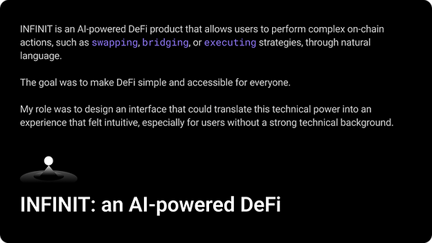
Redesigning an AI Interface to Improve Chat Engagement
How I transformed a technical AI product into a simple chat experience.


My role:
-
Led UX/UI design for INFINIT’s AI-facing product experience
-
Defined interaction patterns for AI-driven actions and confirmations
-
Designed and iterated multiple homepage and chat layout concepts
-
Facilitated internal brainstorming and design critique sessions
-
Synthesized community feedback into product improvements
My team:
-
Design: 1 UX/UI Designer (Me), 1 Graphic Designer
-
Development: 3 Developers
-
Product Management: 1 PM
-
AI & Blockchain: 3 AI Engineers


My initial opinion:
At the beginning, I believed that clearly exposing system capabilities would help users trust the AI.
So in my first version, I leaned toward a more technical interface—showing structured information, system-like layouts, and explicit controls.
From a design perspective, it was logical. From a user perspective, it turned out to be intimidating.


The feedback was consistent:
-
The interface felt powerful, but not welcoming
-
Non-technical users weren’t sure how to start
-
The AI felt more like a tool for experts than a guide for everyday users
This was the moment I realized my mistake:
I designed for how the system works, not how people feel when using it.


The challenge: A product that felt too technical
In the first version, the interface closely reflected how the system worked. It exposed structured information, technical labels, and explicit controls in an attempt to build trust and transparency.
However, this approach unintentionally created friction:
-
Non-technical users felt intimidated and unsure where to start
-
The interface looked more like a tool for experts than a guide for everyday users
-
Users hesitated to initiate conversations, resulting in low chat
The core issue wasn’t that users didn’t understand DeFi —
it was that the product didn’t invite them to engage.
How might we redesign the AI interface
so users feel confident starting a conversation?
The solution:
To move away from a technically heavy interface, I explored multiple homepage directions.
To avoid bias, I brought these options into a cross-functional brainstorming session with product, engineering, and community stakeholders, using them as conversation starters to gather feedback on what felt most approachable for non-technical users.
The discussion revealed a strong preference for the most minimal direction, where distractions were reduced, and conversation remained the primary focus.
These insights directly informed the final UI direction.


The final UI:
The final design reflects a shift from a system-centric interface to a conversation-first experience.
Design principles applied:
-
Reduce cognitive load: show only what’s necessary at each moment
-
Conversation first: reinforce chat as the primary interaction
-
Progressive disclosure: reveal complexity only when users are ready
-
Design for confidence: guide users without overwhelming them
01 Homepage
The homepage was redesigned to feel lighter and more inviting.
Visual noise was reduced and technical elements were minimized, allowing users to immediately understand that they can start by typing.
This lowered the entry barrier and made the AI feel less intimidating for first-time users.


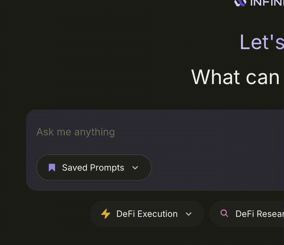
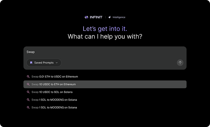
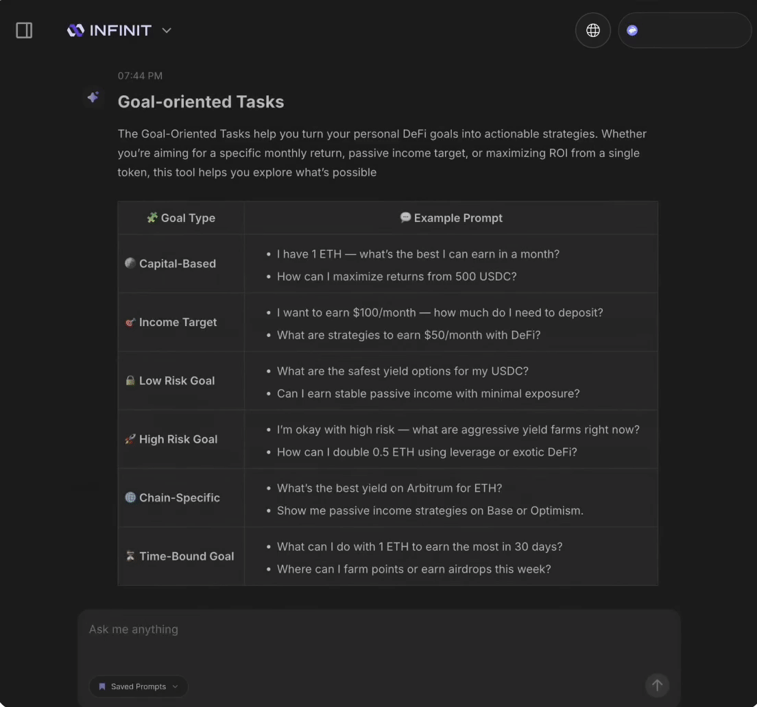
02 Prompt suggestion
I added Prompt suggestions into the chat experience to help users get started.
These suggestions act as guidance rather than instructions, especially for users unsure what the AI can do.


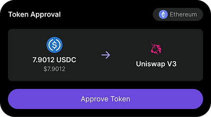
03 Chat interface
The chat interface was refined to feel more conversational and less transactional.
Action cards were redesigned with clearer hierarchy and friendlier language, helping users understand outcomes and next steps before committing to any action.


The impact:
+82%
increase in total chats, indicating stronger engagement and confidence.
10,203
total strategies executed
+100%
A large volume of organic praise on Twitter, specifically highlighting the improved UI and ease of use
More importantly, users began describing INFINIT as:
“easy,” “approachable,” and “finally something I don’t need to overthink”

