Alpha Innovations Lab | 2024
Redesigning a DeFi Dashboard to Reduce User Drop-off
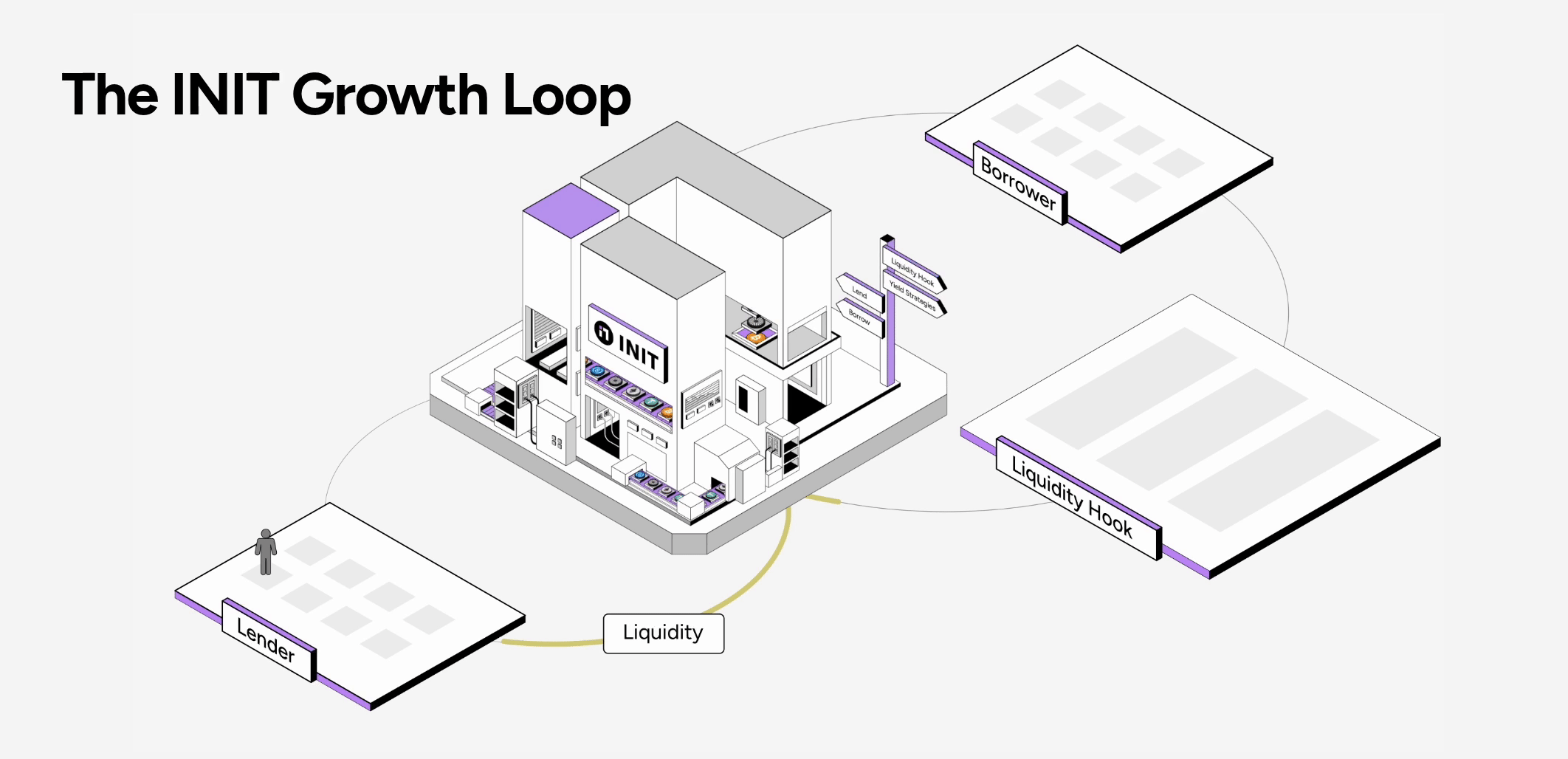
How I visualized a complex DeFi dashboard to help users make faster decisions.


My role:
-
Led the end-to-end UX/UI redesign of INIT’s user dashboard
-
Conducted user research and analyzed insights into actionable design decisions
-
Designed interaction flows, information hierarchy, and visual systems
-
Collaborated closely with product managers and engineers to ensure feasibility and accuracy of on-chain data representation
My team:
-
1 UX/UI Designer (Me)
-
2 Graphic Designers
-
1 Product Manager
-
3 Engineers

The existing dashboard struggled to support efficient decision-making—especially for users managing multiple assets and positions.
The research: In-depth interview
I conducted in-depth interviews with active INIT users, ranging from experienced DeFi users to those newer to lending protocols.

The challenge:
-
Users had to open their wallet repeatedly to verify balances
-
Asset availability and eligibility were unclear within the dashboard
-
Some users attempted transactions with unsupported assets or insufficient balances, leading to failed actions and frustration
The solution:
I redesigned the INIT dashboard to visualize users’ wallet assets directly within the product, turning it into a single source of truth.
-
Clear visualization of available assets and balances
-
Immediate feedback on which tokens were eligible for lending
-
Reduced reliance on external wallets during decision-making
-
Improved information hierarchy to guide users from insight → action
The redesign shifted the dashboard from a passive data display into an active decision-support tool.


The impact:
-
INIT reached $270M in Total Value Locked (TVL) within four months following the redesign and related product improvements.
-
Users could make faster, more confident lending decisions without switching tools.
-
Community feedback highlighted improved clarity and ease of use, particularly for multi-asset users